A Game branding for Toggle series Glitch!
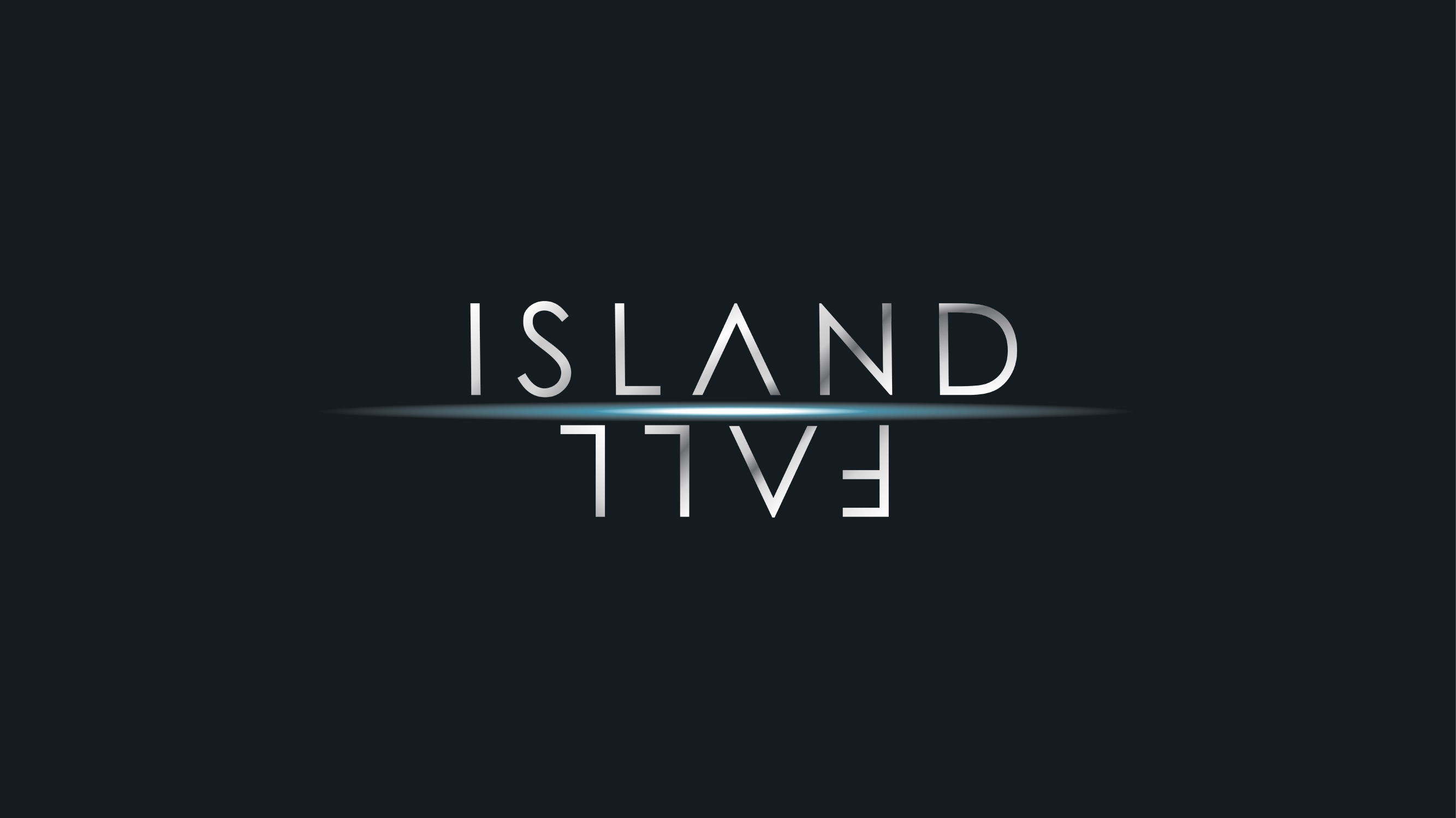
The Island Fall logo is designed with
clean and futuristic aesthetics.
The gameplay invovles players putting
their survival skills to test by escaping
to a lighthouse.
The logo also plays on the concept of
reflection in water, by keeping the word
‘FALL’ in an upside-down position. The glow
effects and choice of colours also give the
logo a sci-fi and mysterious look.
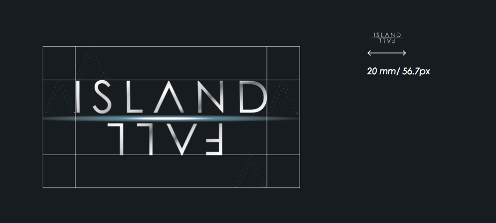
Island Fall